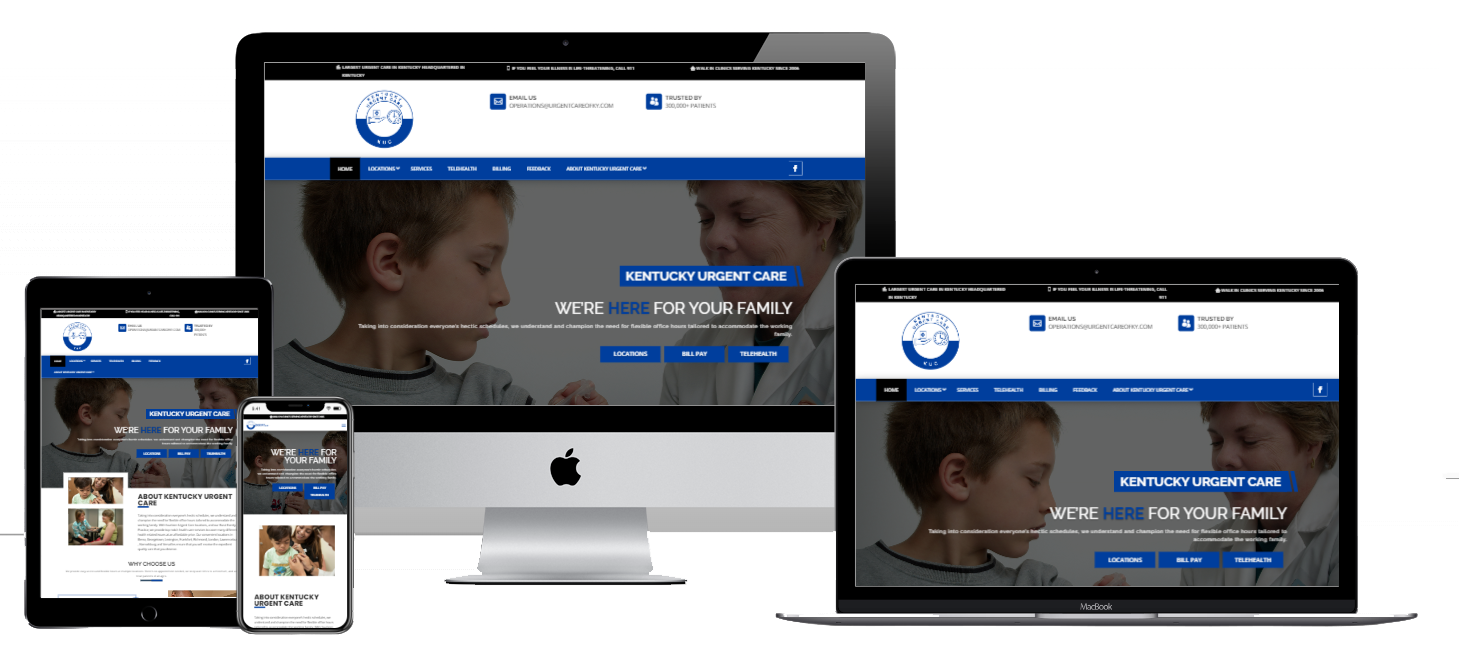
Urgent Care of Kentucky, a leading urgent care provider with 15 locations across Central Kentucky, including Nicholasville, Berea, Richmond, and Lexington, recognized the need for a significant upgrade to its website. Their previous site, while functional, had become outdated and no longer represented the wide range of services they offer, from physicals and lab work to trauma care and treatment for various illnesses. As a provider committed to delivering high-quality healthcare with flexible hours, they needed a website that was as dynamic and efficient as their service offerings.
The Project Goals:
The primary goal of the website redesign was to create a modern, user-friendly experience that would not only reflect the professionalism of Urgent Care of Kentucky but also make it easier for patients to access the services they need. This included the integration of their newly introduced Telehealth service, which allows patients to consult with healthcare providers from the comfort of their homes. Additionally, the site needed to clearly present the details of all 15 locations, including contact information and hours of operation, ensuring that patients could quickly find the nearest facility.
Design and Development Process:
Our team approached the project with a focus on creating a clean, responsive design that would perform well on both desktop and mobile devices. Given the importance of mobile accessibility in today’s digital landscape, we ensured that the site was fully optimized for smartphones and tablets. This not only enhances the user experience but also aligns with current trends in healthcare where more patients are using mobile devices to manage their health.
One of the critical challenges we addressed was improving the site’s Search Engine Optimization (SEO). We created a dedicated page for each of the 15 locations, complete with the facility’s address, phone number, and operating hours. Each location page features an integrated Google Map, allowing visitors to get directions directly from their device. We also included quick links that enable users to call the facility, make payments, or schedule a Telehealth appointment with just a few taps. These enhancements were crucial in improving the site’s visibility on search engines, making it easier for potential patients to find and access services.
Telehealth Integration for Urgent Care of Kentucky:
Understanding the growing demand for online healthcare services, we integrated Calendly into the Telehealth page, enabling patients to book appointments directly through the site. This feature is designed to simplify the appointment scheduling process, allowing users to select a convenient date and time without leaving the website. The seamless integration of Telehealth scheduling is a significant improvement that enhances patient convenience and aligns with the facility’s commitment to providing accessible care.
Secure Online Payments:
We also prioritized the security of online transactions. The new website includes secure links to the Urgent Care of Kentucky billing portal, where patients can make payments for services rendered. By incorporating these secure payment options, we ensured that patients could easily and safely manage their healthcare expenses online.
Careers Page and Employee Engagement:
A notable addition to the redesigned site is a comprehensive careers page, which was missing from the previous version. Urgent Care of Kentucky wanted a space to highlight their workplace culture and attract potential employees. We designed the page using an accordion layout that provides an engaging way to showcase what it’s like to work at the facility. Each section offers insights into the company’s values, employee benefits, and growth opportunities, with a prominent button for browsing and applying for open positions. This addition not only aids in recruitment but also strengthens the organization’s brand as an employer of choice in the healthcare industry.
Ongoing Maintenance and Optimization:
To ensure the website remains up-to-date and secure, we enrolled the site in our care plan. This includes regular updates, backups, and access to premium plugins such as Gravity Forms, WP Rocket, and iThemes Security. These tools help keep the site fast, secure, and functioning smoothly, ensuring that it continues to meet the needs of both the facility and its patients.
Conclusion:
The redesigned website for Urgent Care of Kentucky is more than just a facelift; it’s a comprehensive upgrade that enhances functionality, improves user experience, and aligns with the facility’s mission to provide high-quality, accessible healthcare. Whether it’s finding the nearest location, scheduling a Telehealth appointment, or exploring career opportunities, the new site offers a seamless experience for all visitors.
If you’re interested in transforming your online presence with a modern, responsive website, or if you want to learn more about our maintenance plans, we invite you to contact us and schedule an appointment. Let us help you create a digital experience that reflects the excellence of your services.


